Tutorial: How to Create a Business Flyer Template in Photoshop
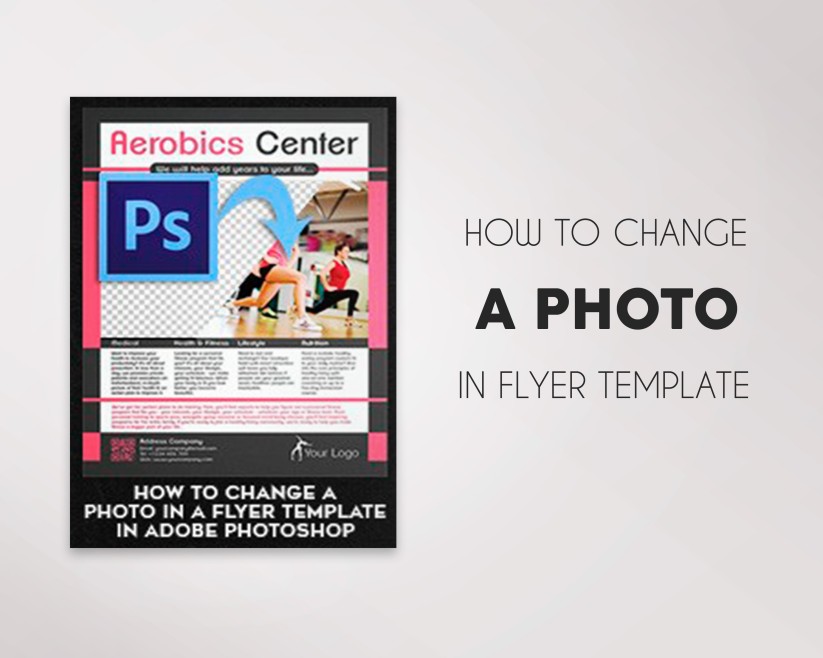
If you are short of time or you are lack of graphic design skills for creating a flyer from scratch, we have a solution – pre-designed PSD flyer templates which you can easily customize in Photoshop with your specific colors, images, and branding.
Step 1. Getting Started. Creating a File
In order to create to create a flyer, you need to create a file. Go to Photoshop, click on the “File” tab and click on “New”. Or, you can save a few minutes and create a new file with a help of a magic keyboard shortcut “Ctrl+N”. In a popup window you will need to write down a new file details (name, size…). All the flyers on elegantflyer.com have 8,5″ х 11″ with 0,25″ bleed (2625×3375 px) size, so let’s continue with this size.
In this tutorial we will create a Bus Travel business flyer, so let’s call it “Bus Travel” in the “Name” field. The width and height are 2625×3375 px, or 8,75″ х 11,25″ (bleeds should be taken into account). Let’s also choose the resolution to 300 DPI (dots/inch), CMYK 8 bit color scheme and a white background.
Step 2. Setting Up File with Guides
First, let’s add new guides which will indicate the bleed area. Go to “View” tab and click on a “New Guide…”.
In the popup window choose vertical and horizontal guides with an indent in the beginning of a document (horizontal 0,2 inches, vertical 0,25 inches, horizontal 11 inches and vertical 8,5 inches). As a result, we will get guides with a 0,25” position from the edge of a document.
Step 3. Creating a Background
In order to create a background, click on “Create new fill or adjustment layer” in the “Layers” window and choose “Gradient…”. You can open “Layers” window with the help of «Window» tab and find “Layers”, or you can simply click on F7 to open “Layers”).
In the opened window click on the gradient bar and select the needed colors. The color opacity can be adjusted with the help of the top rollers of the “Opacity” bar. (100% means opaque). Colors are adjusted with the help of rollers below in the “Color” bar. Let’s select the color #3e347e with the help of a left-hand roller and #e0218c with the help of a right-hand roller and keep with 100% opaque.
Press “OK” and continue to edit gradient. Let’s keep the “Linear” style, the 68% “Angle”, and a «Scale» set to 150%. Then press on the document and pull a gradient a little bit lower and press “OK”.
Let’s add some light with the help of gradient. Create a new layer with the help of the shortcut “Ctrl+Shift+N”, or click on “Create a new layer” in the “Layers” window. Then click on the “Gradient Tool” in the actions panel and set a radial gradient in the top panel, with an initial white color and the final with 0% opacity.
Now, let’s draw a gradient and set the following properties in the “Layers” window: the “Color Dodge” overlay mode and a 60% fill.
Step 4. Adding Objects
Click on «Pen Tool» and select the top area of the document by clicking on a left button of a mouse. Select a white color.
Once you have joint an area, press “Shape” button. The shape should become white. If you need another color, then go to the “Layers” window and double click on the current layer icon to choose another color. Now, choose the «Convert Point Tool» and move the created dots.
After such manipulations, you will get the following object. Don’t be afraid to cross the edges of the document.
Let’s create another object in the same way. It will serve as a frame for an image. Let’s make it grey.
Continue to create objects. The areas for images are highlighted in grey.
Now, let’s create a line that will separate contact details from the main text. Choose the “Line Tool” and select a yellow color.
Make the width of the line 1 px and draw a line under 45° by holding «Shift» key. The length is approximately 0,12”.
Duplicate the line with the help of «Layers» window. Drag the layer to the icon of creating a new layer.
Let’s display line horizontally with the help of the “Rectangular Marquee Tool”.
With the help of the “Move Tool” move the line to the right.
Create a stripe by duplicating these lines.
Step 5. Adding Images
In order еще do this, click on the “File” tab and select “Place…”. Pick the proper image from your computer and press “Place” button.
If you don’t like the image disposition or size, you can easily change them. Drag and change the image size and position by simply pulling the corners of the image with the help of the mouse. To keep the aspect ratio unchanged, hold the “Shift” key and pull the corner of the image by a left mouse button in the needed direction. In order to apply changes press “Enter”, or click on the check mark in the top panel.
To make an image match the boundaries of the object that we have created earlier, you need to move the image in the layers above the object and, by holding “Alt”, click the left mouse button between these layers. Here what you’ll get:
Add another image in the same way.
Step 6. Image Editing
Now let’s create an effect of an overriding bus. Click on the «Rectangular Marquee Tool». Once you selected a layer of the image, highlight the needed area, click on the right mouse button and choose “Layer Via Copy”. The selected area of the image will be copied to the newly created layer.
Then add a mask to this layer by clicking on the «Add vector mask» icon in the «Layers» window.
Choose a black color (black color erases, white color restores) and brush the unneeded areas on the layer mask with the help of the «Brush Tool». Leave only the bus.
Do the same with buildings in the background, so we can display a text below. For convenience, you can change “Fill” of the layer to 30%.
Step 7. Adding Text and Other Elements
Let’s add a name with the help of the «Horizontal Type Tool».
You can edit the text with the help of the top panel that allows changing a font and its size, disposition and color if the text. Press a check mark once finished with editing.
Now we should move the text to the background mode. Move the layer with buildings (which we have cut out earlier) above of the text.
Now, we need to add a QR code. Open the «File» tab and click on the «Place…». Select the QR code on your computer and press the “Place” button. Move it to the bottom left corner. Do the same with the logo and move it to the bottom right corner. Here what you should get:
Don’t let the text to cross the guides, as these are the bleeds of the flyer.
Step 8. Adding Effects
To make colors rich, let’s add “Curves”, “Color Balance” and “Levels” above layers. Click on the “Create new fill or adjustment layer” icon in the “Layers” window and fine-tune one by one the above-mentioned amendments. Edit them as it thinks fit. Further, you can edit them by mouse double clicking on the layer icon.
The final step is adding a fleck of sunlight. It’s an optional effect. Open the “File” tab and click on “Place…”. Choose a downloaded fleck without a background (png) and click on “Place”. Pull it to the windshield of the bus. The overlay mode is “Screen”.
